Data Visualization
The Power of Data Visualization: Transforming Insights into Actionable Intelligence
Unlock the potential of data visualization to drive business success. Discover how visualizing complex data through charts, graphs, and interactive dashboards can uncover patterns and correlations that go unnoticed in raw data alone. Explore the benefits of data exploration, trend identification, and interactive storytelling. Enhance collaboration, make informed decisions, and improve performance. Choose the right visualization techniques, adhere to design principles, and leverage cutting-edge tools for effective visualizations. Trust Analytics Safe for comprehensive data visualization services. Contact us to unlock the power of your data today!
Jun 19, 2023

As a business owner, you understand the importance of data in driving informed decision-making and gaining a competitive edge. However, raw data alone is not enough to extract meaningful insights. This is where data visualization comes into play. Data visualization is the art of presenting data in a visual format, such as charts, graphs, and interactive dashboards, to effectively communicate complex information. In this blog, we will explore the power of data visualization in transforming insights into actionable intelligence, helping you make informed decisions that drive business success.
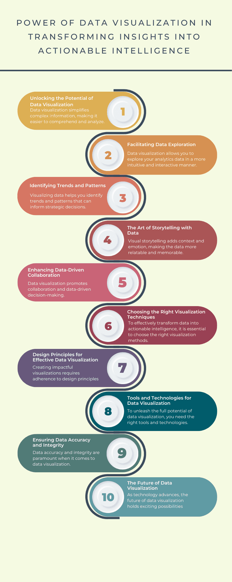
Unlocking the Potential of Data Visualization
In today's data-driven world, businesses have access to vast amounts of data. However, without proper visualization techniques, this data can remain untapped potential. Data visualization simplifies complex information, making it easier to comprehend and analyze. By presenting data visually, you can uncover patterns, trends, and correlations that may not be evident in raw data alone. This empowers you to make informed decisions and take action based on reliable insights.
Facilitating Data Exploration
Data visualization allows you to explore your analytics data in a more intuitive and interactive manner. Instead of sifting through rows and columns of numbers, visualizations provide a comprehensive overview of your data. With just a glance, you can identify key metrics, spot outliers, and gain a deeper understanding of your business performance. Interactive visualizations enable you to drill down into specific data points, enabling more detailed analysis and uncovering valuable insights.
Identifying Trends and Patterns
Visualizing data helps you identify trends and patterns that can inform strategic decisions. Through line graphs, bar charts, and other visualizations, you can track changes over time and detect recurring patterns. This knowledge allows you to adapt your business strategies accordingly, capitalize on emerging trends, and mitigate potential risks.
The Art of Storytelling with Data
Data visualization goes beyond presenting numbers and statistics – it enables you to tell compelling stories with your data. By crafting narratives around your visualizations, you can effectively communicate insights to stakeholders, clients, and team members. Visual storytelling adds context and emotion, making the data more relatable and memorable. Whether you're presenting sales figures, customer demographics, or market trends, data visualization turns dry information into engaging narratives.
Enhancing Data-Driven Collaboration
Data visualization promotes collaboration and data-driven decision-making within your organization. By creating visually appealing dashboards and reports, you can share insights with team members and stakeholders in a format that is easy to understand and interpret. Visualizations facilitate discussions, foster shared understanding, and align everyone toward common goals. This collaborative approach drives better decision-making and improves overall business performance.
Choosing the Right Visualization Techniques
To effectively transform data into actionable intelligence, it is essential to choose the right visualization techniques. Different types of visualizations, such as bar charts, line graphs, pie charts, and heatmaps, have their strengths and best use cases. Bar charts are ideal for comparing quantities, line graphs for showing trends over time, pie charts for displaying proportions, and heatmaps for visualizing complex data relationships. By selecting the most suitable visualization techniques for your data analysis needs, you can effectively communicate your insights and facilitate decision-making.
Design Principles for Effective Data Visualization
Creating impactful visualizations requires adherence to design principles. Proper selection of color palettes, labels, titles, and data simplification ensures visual clarity and comprehension. A well-designed visualization guides the viewer's attention and highlights the most important insights. By following design best practices, you can create visually compelling and informative visualizations that effectively communicate your message.
Tools and Technologies for Data Visualization
To unleash the full potential of data visualization, you need the right tools and technologies. Popular data visualization tools offer powerful features and capabilities. These tools allow you to create interactive dashboards, customize visualizations, and perform advanced data analysis. When selecting a tool, consider factors such as ease of use, scalability, integration capabilities, and your specific business requirements.
Ensuring Data Accuracy and Integrity
Data accuracy and integrity are paramount when it comes to data visualization. To maintain the reliability and credibility of your visualizations, it is crucial to prioritize data quality. Implement data governance practices, verify the accuracy of your data sources, and establish data validation processes. By ensuring the accuracy of your data, you can trust the insights derived from your visualizations.
The Future of Data Visualization
As technology advances, the future of data visualization holds exciting possibilities. Emerging trends such as augmented reality (AR), virtual reality (VR), and immersive data visualization experiences have the potential to revolutionize the way we analyze and interact with data. These technologies can provide immersive and engaging experiences, allowing for deeper exploration and understanding of complex datasets.
Conclusion
Data visualization is a powerful tool that can transform complex data into actionable intelligence. By effectively visualizing data, you can unlock insights, make informed decisions, and drive business success. By implementing the strategies outlined in this blog, such as choosing the right visualization techniques, adhering to design principles, and leveraging interactive dashboards, you can harness the power of data visualization to gain a competitive advantage in today's data-driven world.
Remember, data visualization is an ongoing process that requires continuous refinement and adaptation. By staying updated with the latest tools and technologies and embracing innovative approaches, you can continue to leverage the power of data visualization to propel your business forward.
In our comprehensive data visualization services, we understand the importance of simplifying complex information and making it easily understandable. Our team of experts will guide you through the power of data visualization, showing you how it can enhance comprehension, improve decision-making processes, and ultimately contribute to your business success.
By leveraging the benefits of data visualization, you'll gain a competitive edge in the market. Explore the vast possibilities of data exploration, identify trends and patterns that were previously hidden, and tell compelling stories with your data. Our experts will help you choose the right visualization techniques, such as bar charts, line graphs, pie charts, and heatmaps, ensuring that your data is presented in the most effective and engaging way possible.
But it doesn't stop there. We go beyond just presenting your data – we ensure that your visualizations adhere to design principles that make them visually compelling and informative. From selecting the right color palette to simplifying complex data and ensuring visual clarity, our team will guide you through the key design considerations to create impactful visualizations that resonate with your audience.
To bring your data visualization journey to life, we work with cutting-edge tools and technologies. Our experts will help you select the most suitable tool for your business, taking into account your specific needs and requirements. With these powerful tools at your disposal, you'll have real-time access to critical insights through interactive data dashboards, empowering you to explore data dynamically and make informed decisions on the fly.
At Analytics Safe, we prioritize data accuracy and integrity. We understand that reliable data is the foundation of effective visualization. Our team will guide you through data quality measures, governance practices, and verification processes to ensure that your visualizations are based on accurate and trustworthy data, maintaining their reliability and credibility.
As the future of data visualization unfolds, we stay at the forefront of emerging trends. Our experts will keep you informed about these advancements and help you embrace innovative approaches to stay ahead of the curve.
Ready to consolidate your Google Analytics data and gain valuable insights? Contact us now and let Analytics Safe empower your small business with streamlined data migration and predefined dashboards. Our team of experts is dedicated to helping you harness the full potential of data visualization to make data-driven decisions that drive business success. Take the next step towards unleashing the power of your data – get in touch with us today and embark on an exciting journey of data-driven growth and success.
